2022
Fintip
Financial Wellness made easy

About the product
Fintip is a prototype aimed to help people effectively reduce their utility costs.
My role
UI/UX Designer, UX Researcher.
Main project goal
Make finance tracking process for utility costs easier and more convenient.
Discovery
Backstory
Fintip was conceived during the 'UX & UI Design' course, held in the 5th semester of my Communication Design BA program at HTW Berlin. The idea for a financial advisory app emerged when I learned about the gas crisis in Europe and noticed the growing concerns over escalating utility costs among many people.
With the Fintip app, my aim was:
To offer a solution that assists individuals in managing their expenses while maintaining a positive and encouraging tone.
The app tracks monthly expenditures for gas, heating, electricity, and water, enabling users to monitor their progress.
This provides them with financial control and encourages optimization of expenses to meet personalized goals.
Challenge
With this app, I aimed to demonstrate that it is possible to manage user's finances effectively even in the face of challenges such as the gas crisis and global recession. While this remains a conceptual project, I firmly believe that this app has the potential to alleviate financial concerns for many individuals and help them achieve their goals.

I conducted interviews on 12 of my university classmates, defined their pain points and analysed the results.

Goals and objectives
The objective of the 'UI & UX Design' course was to identify an existing problem that impacts people on a daily basis and develop a design prototype to address the issue or offer a unique solution.
Throughout the course, we also acquired knowledge about advanced features in Figma, such as animations, prototyping, and creating responsive designs.
The most crucial aspect for me personally was learning about various UX research methods and having the opportunity to apply them to real users during the course.
Information Architecture and Persona
After conducting interviews, I decided to define the overall functionality of the app by:
Brainstorming ideas and collecting possible features of the app.
Creating an Information Architecture to ensure an intuitive experience and have a well-structured overview of the app.

With the help of data gathered from online Zoom interviews and a Google Forms survey, I created the persona 'Lena'. The survey provided quantitative insights, including income levels and preferences related to personal finance. Lena's persona represents her motivation to enhance financial management and reduce monthly expenses, particularly utility costs.
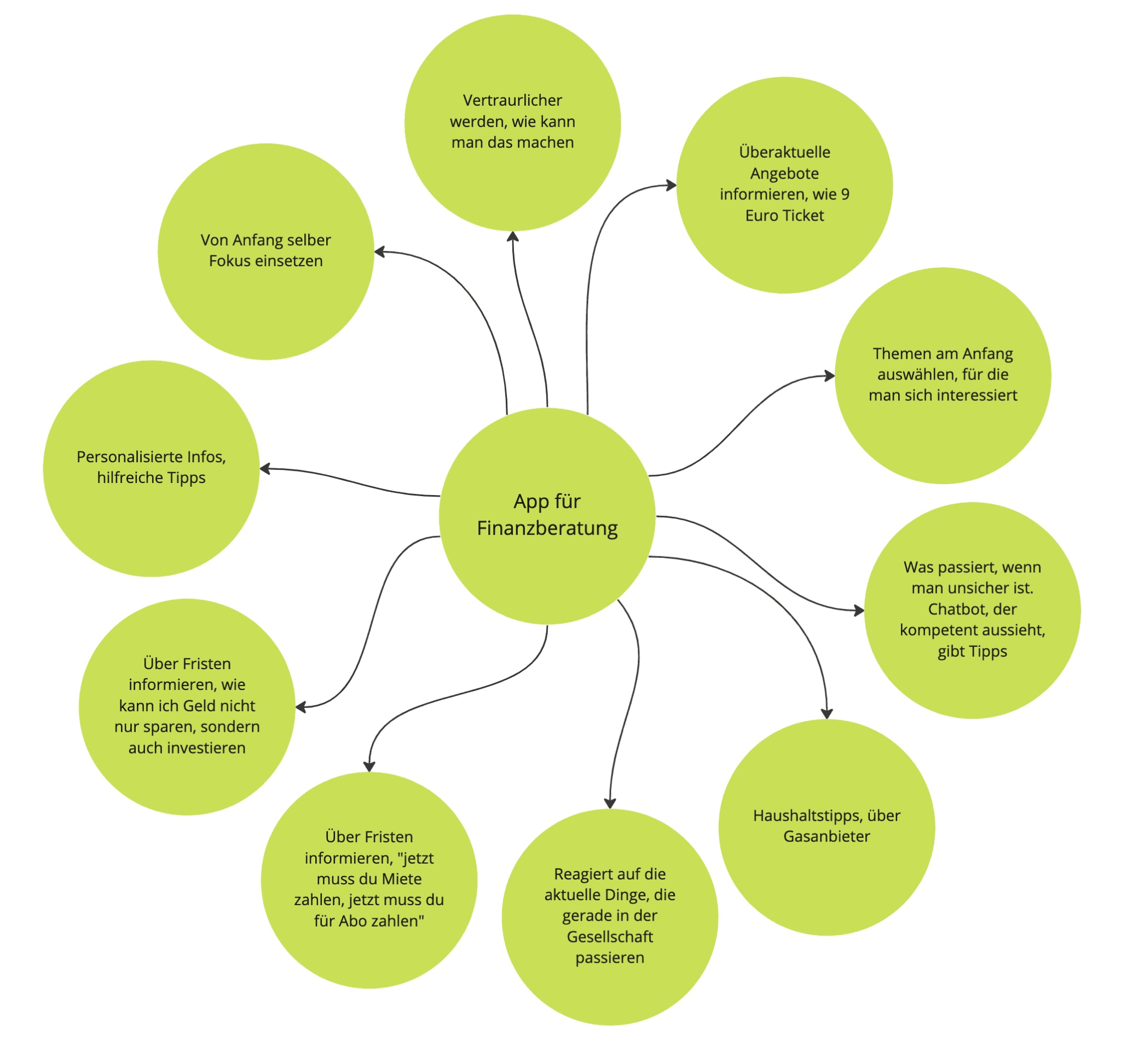
Possible app functionalities.

Structured and defined functionality of the App after defined by Information Archiecture.
Wireframes
Design spring
I sketched a few ideas after my research. The initial approach involved four primary sections: feed, chatbot, search, and profile. The feed, featuring tips and the latest financial stats, is intended to help users better manage their finances. The chatbot is designed to assist users with questions related to financial management.


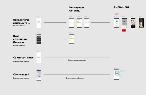
Some process screens.
Usability test
After consulting with my university lecturer, receiving a couple of design critiques, and conducting a short feedback session with my classmates, I decided to remove the profile section. The settings menu could be easily accessed from the upper right corner of the feed. Since Fintip focuses more on financial advisory rather than being a social app, the profile part was considered less important than the other three.
Execution
Design Base
Even though I had limited time for the project, I made sure to create a solid brand identity. This included choosing font pairings, colors, creating a logo, icons, and smaller elements as part of a design system. I aimed to capture the look of the fintech app while keeping things simple and user-friendly.

Final designs
As decided during usability testing, I chose to remove the profile section. This made the app simpler and focused more attention on the other three main sections. During this project, I learned how to evaluate ideas early on, turn them into wireframes, and organize the app's functionality with the help of information architecture. I also gained valuable insights from my classmates and university lecturer who assisted during user testing.


