2026
Yazio
Driving Retention, Personalization & App Rebrand

About the product
Yazio is a nutrition and food-tracking app with over 100 million users that helps building healthier eating habits through AI calorie tracking, meal planning, progress monitoring, and personalized insights.
My role
Main goals
Improve retention during the critical first seven days after signup.
Identify opportunities for meaningful personalization and contextual insights.
Support Yazio's ongoing rebranding through product-level redesigns.
Strengthen and expand the design system through reusable components and patterns.
Challenge
One of the biggest challenges was early user drop-off.
Users were downloading Yazio, starting to track their food, and then leaving within the first week. We needed to understand what was happening during this critical period and identify opportunities to make the product more motivating before a habit had formed. At the same time, research and user feedback revealed another opportunity: users wanted Yazio to feel more personal. Users wanted the product to interpret their activity and give them a reason to come back. This created an opportunity to explore a new personalized widget and contextual insights based on their food logs. The central question became:
How might we make Yazio more personally relevant during the first seven days, while giving users meaningful reasons to return and continue tracking?
Research & Problem Framing
Understanding users
Over approximately six weeks, I conducted interviews with 25 users, including both active users and users who had churned.
For active users, I recruited participants through clickable recruitment cards placed inside the Profile section of the app. For churned users, I worked with the User Success team to reach out directly via email and invite them to participate.
The interviews helped us understand:
What motivated people to continue tracking.
Where the experience became frustrating or repetitive.
What prevented users from forming a tracking habit.
How users perceived gamification and progress.
What would make them return to the app when they had not logged anything yet.
I also partnered with the User Success team to collect relevant app-store reviews, complaints, and recurring feature requests. This gave me another perspective on what users were struggling with at scale.

I recruited active users through clickable cards in the Profile section.
The Process


I also conducted usability testing around the Calendar experience to identify navigation and comprehension issues before redesigning the feature.
Once the qualitative research was complete, I facilitated a thematic analysis workshop with the Product team. Together, we grouped observations, identified recurring pain points, and translated them into jobs-to-be-done.
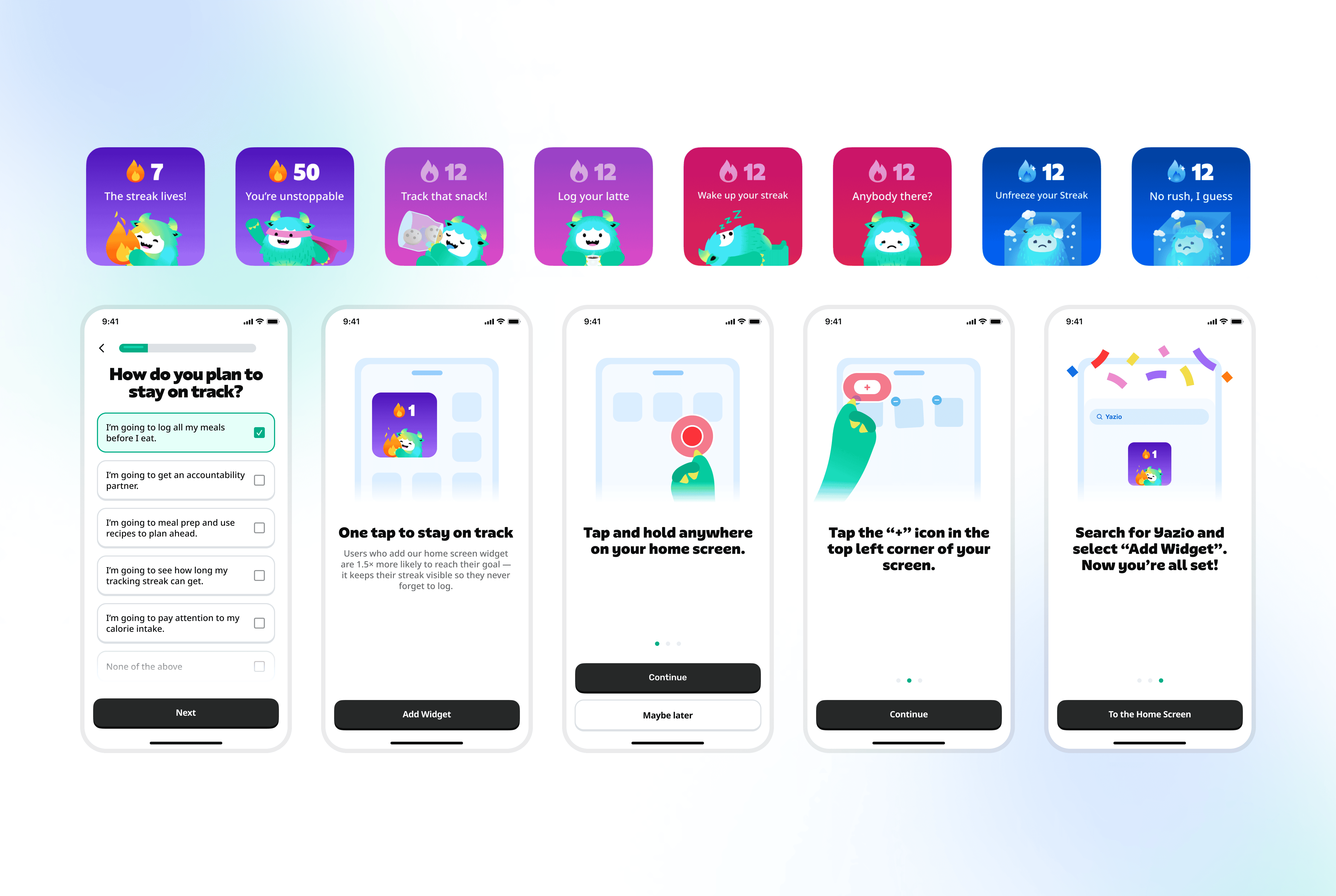
Personalized Yettie Widget

Interactive mood scenarios based on user's meal log status.

Widget Installation tutorial as a part of Onboarding scenrio.
The opportunity came directly from the research: users wanted more personalized insights rather than generic information. We explored how Yettie could react to a user's food logs and present different contextual scenarios depending on what they had done.
I iterated toward a more lightweight experience built around interactive mood scenarios, allowing Yettie to respond to the user's behavior without overwhelming them.
Another challenge came from the existing technical architecture. Some of the behavioral signals we initially wanted to use were not immediately available to the iOS widget. Together with developers, we narrowed the first version to signals that could be reliably accessed while keeping the architecture extensible for future personalization. Rather than trying to build the complete personalization engine immediately, we focused on a smaller set of scenarios that could be launched, measured, and iterated on.
Outcome
The final widget achieved high adoption shortly after launch and contributed to a +1.2% improvement in retention within the first weeks.
Calendar Redesign
The Calendar was another important part of the experience and was redesigned as part of the broader Yazio rebranding. The existing experience contained valuable information but required users to interpret several different visual elements to understand their progress.
I focused on improving:
Information hierarchy.
Navigation between months.
Visibility of the current calorie progress and streak.
Consistency with the new visual language.
Before finalizing the solution, I conducted usability testing to identify where users struggled and used those findings to inform the redesign. The result was a cleaner Calendar that made progress and streaks easier to scan while introducing the updated brand expression.
The redesigned Calendar contributed to:
+0.9% retention
+44% daily active visits to the Calendar

Usability testing was conducted on 6 participants from different strategic countries.

Before rolling out the Calendar, we ran an A/B test comparing two variants: a simpler one and a more granular view of calorie-tracking progress.
Design System & Rebranding
Execution & Developer Collaboration

Defining V1 scope with Engineering.
I involved Engineering early to discuss technical constraints, existing component capabilities, data availability, edge cases, and potential alternatives rather than waiting until the designs were finished. For more complex features, we agreed on a V1 scope that could deliver meaningful user value while keeping the implementation realistic.
Handoff
Before handing designs over, I prepared a pre-handoff checklist covering states, interactions, design references, localization copy, responsive behavior, component usage, and design-system references.
I also ran walkthroughs with developers before implementation and again during the final handoff stage to make sure the intended behavior was clear.
Outcomes & Impact
Sources: Omni, Yazio User Success Q3 report.
What I learned
Final designs